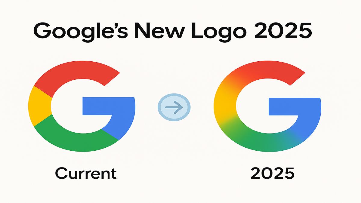
In 2025, Google unveiled a fresh update to its iconic “G” logo, marking the first major redesign in ten years. This change has caught the attention of users, designers, and branding experts across the world. Here’s everything you need to know about the new Google logo, its meaning, public reactions, and what it signals for Google’s broader ecosystem.
Why Did Google Change Its Logo?
Google’s decision to refresh its logo in 2025 aligns with its evolving focus on artificial intelligence and product unification. The company aims to reflect a more modern, dynamic, and AI-forward identity that better represents products like Gemini and other next-gen services.
According to Google, the redesign is “part of a broader visual transformation to unify our AI-powered tools under one cohesive brand.”
What Is the Meaning Behind the Gradient ‘G’?
The most striking element of the new logo is the gradient in the iconic “G.” Unlike the previous solid color palette, the new logo features a smooth gradient that transitions between Google’s classic blue, red, yellow, and green hues.
This gradient symbolizes:
- Fluidity and motion, indicating Google’s AI-driven adaptability.
- Depth and innovation, moving beyond the flat design of the past.
- A visual link to Gemini, Google’s AI assistant platform, which also uses a gradient-rich design.
How Are Users Reacting to the Logo Update?
The logo change has sparked a flurry of reactions online:
- Designers have praised the logo for its cleaner, more modern feel.
- Casual users expressed surprise and curiosity, with some missing the old design.
- Memes and lighthearted commentary flooded social platforms like X (formerly Twitter) and Reddit.
In short, the redesign has successfully generated buzz—a key component of any major rebranding.
A Look Back: Google Logo History
Google has updated its logo multiple times since its founding:
- 1998–2010: Serif typeface with shadows
- 2010–2015: Flattened, brighter design
- 2015–2025: Sans-serif typeface with flat primary colors
- 2025–present: Gradient ‘G’ symbol, reflecting the shift to AI
Each change has marked a major technological evolution within the company.
What Is the Google Gemini Logo Design?
The Gemini branding features a distinctive use of gradients, abstract curves, and soft hues to suggest intelligence and responsiveness. The 2025 Google logo mirrors this visual identity, hinting that Gemini and the core Google brand are becoming more tightly integrated.
Google App Icon Updates for iOS & Android
With the logo update, many users are noticing refreshed app icons for services like Google Search, Assistant, and even the Google app itself. The icons now feature a gradient-heavy aesthetic, with improved contrast for dark and light mode.
So far, these updates have rolled out across both iOS and Android platforms.
Google Logo Easter Egg 2025
In typical Google fashion, the launch came with an Easter egg! When searching for “Google logo 2025” or clicking the logo on the homepage, a colorful animation plays, showing the old logo transforming into the new one in a dynamic, gradient swirl.
Try it while it lasts!
Will Gmail and Chrome Logos Change Too?
This update has led to speculation: will other Google services follow suit?
So far:
- Gmail still uses its envelope-M icon, but a redesign with gradient elements may be in development.
- Chrome has already undergone minor visual tweaks, and a new version with subtler gradients may appear later this year.
Google has not officially confirmed updates to all app logos, but signs point to a wider brand overhaul.


 New COVID Variant BA.3.2: Symptoms, Risk...
 NASA’s Artemis 2 Set for April 2026 Laun...
 Akasha300 3D Printer Explained: How It W...


