
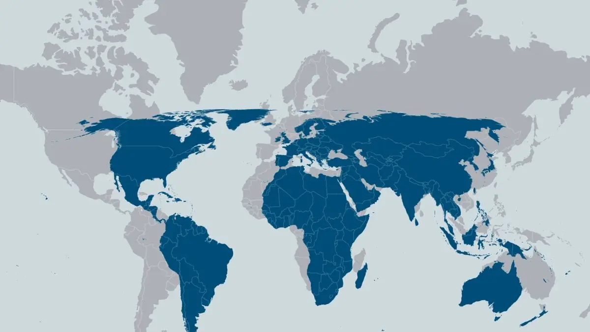
The appearance of the continents depicted on the map might not correspond to their real sizes. The Mercator projection of the Earth has been used for several decades to depict the image of the planet, yet it greatly misrepresents the sizes of areas away from the Equator. Thus, Europe and Greenland may seem to be much bigger in comparison to Africa and South America.
The United Nations General Assembly has adopted the resolution supporting the promotion of the Equal Earth projection, which is a cartographic projection giving a more realistic depiction of the sizes of the continents. The resolution was supported by 164 states; the USA has voted against it, while six countries have chosen to abstain from voting.
The resolution is not obligatory and does not mean that all existing maps should be changed.
What Is the Equal Earth Map Projection?
The Equal Earth map projection was designed in 2018 by cartographers Bojan Šavrič, Tom Patterson and Bernhard Jenny. It differs from the Mercator map projection in that the latter does not distort the relative sizes of continents but strives to maintain the continent shapes recognizable enough.
Indeed, no map projection can depict the three-dimensional world correctly since they have to focus on either shapes, distances, directions or sizes.
While the Mercator projection is very useful for navigation since it preserves directions and angles, it distorts the sizes of continents at high latitudes. In contrast, the Equal Earth map projection tries to help the viewer to grasp how the sizes of continents compare to each other.
Africa: Much Larger Than You Think
Africa is an excellent example of the distortion caused by maps. According to traditional map projections, such as Mercator, Greenland looks almost as big as Africa. However, the reality is quite different because Africa takes up around 30.3 million square kilometres, whereas Greenland occupies only a small part of it.
This factor matters when it comes to travelling. Africa is a huge continent consisting of many countries and regions that are very far away from each other. Visiting places like Kenya, Morocco, South Africa, and Zanzibar means experiencing something entirely different geographically and culturally.
The correct size depiction of the Equal Earth projection will help you understand the size of Africa better.
South America: A Large Geographical Area
South America is another continent that has the potential to appear small when looking at ordinary world maps. The continent has an area of roughly 17.8 million square kilometers.
This large continent comprises geographical areas like the Amazon rainforest, Andes mountains, the coast of Brazil and Patagonia. Countries like Brazil, Argentina, Peru, Chile and Colombia cover large distances.
As far as traveling is concerned, one might find themselves covering long distances to travel through a number of South American countries.
India and the Geography of South Asia
The Indian subcontinent as well as the broader South Asian region is another good example of how geography may be distorted on a global map.
The South Asian region encompasses an area of 5.1 million square kilometers and includes such nations as India, Pakistan, Bangladesh, Nepal, Bhutan, Sri Lanka and the Maldives, among others. It brings together the Himalayan range, deserts, tropical coasts, islands, plains and crowded cities.
India alone is spread across diverse geographical belts, ranging from the Himalayan region in the North all the way down to Kerala in the south, and to the northeastern states and Andaman-Nicobar Islands in the East and Southeast.
A more accurate map based on geographical areas would give a clearer idea of the region’s geography.
Australia – Traveling across an Entire Continent
Australia is yet another destination where the scale on the map has the potential to affect the perception of distances. Oceania covers roughly 8.5 million square kilometers of land with Australia being the bulk of that landmass.
Popular cities like Sydney, Melbourne, Perth, Cairns and Uluru are quite far from one another, and the trip between them involves a lot of flying over different scenery.
Hence, the sheer vastness of Australia must be taken into account while planning your itinerary.
Europe: Smaller but Deceptive
Europe occupies about 10.2 million square kilometres, which means that it is much smaller compared to Africa. However, the location and map depiction of Europe makes it appear much bigger compared to Africa, even though this is not the case.
There are many countries located within Europe occupying a relatively small geographical area. This explains how it becomes possible to visit several countries during one trip because of good road and air links.
Equal Earth projection makes for a more realistic view of Europe in comparison to other continents.
Importance of Map Projection
Map projection is defined as the process of translating the 3D surfaces of the Earth onto a 2D surface.
The Mercator projection gained the importance due to its usage in navigation. But the distortion becomes higher as we move towards the pole, making areas around the pole appear bigger than their real sizes.
The Equal Earth projection is an equal area projection. The purpose of this projection is to keep the correct area proportion of continents and countries with recognizable shapes.
Equal Earth vs Mercator Projection
| Feature | Mercator Projection | Equal Earth Projection |
| Main purpose | Navigation and direction | Accurate area of the comparison |
| Area accuracy | Distorts area, especially near the poles | Preserves the relative area |
| High-latitude regions | Appear disproportionately large | More accurately represented |
| Developed | 16th century | 2018 |
| Key developers | Gerardus Mercator Bojan Šavrič, | Tom Patterson and Bernhard Jenny |
| Major advantage | Preserves angles and directions | Shows relative continental size |








 Duleep Trophy Winners: Complete List fro...
 Delhi-Bihar Bullet Train: Route, Speed, ...
 What Is the BRICS Cross-Border Payment S...